Take this chart and explanation here.
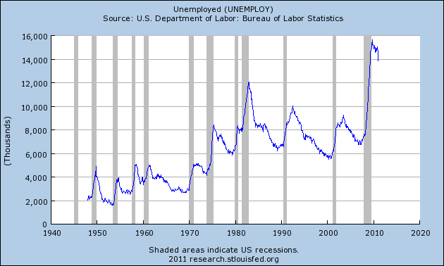
What is missing from this chart? Anyone who says, "The numbers aren't controlled for population increases and thus aren't worth a plugged nickle" hits the bell and gets their choice of coconut or honey doughnut.As tens of thousands of U.S. factories get shut down and as millions of our jobs get shipped overseas, the number of unemployed Americans continues to go up and up and up
As you can see from the chart below, there has been a long-term trend of increasing unemployment in the United States. In fact, there are about 3 and a half times as many unemployed workers in the United States today as there were when 1970 began. These jobs losses are going to continue as long as we allow our corporations to pay slave labor wages to workers on the other side of the globe. All of the major trends in global trade are very bad for the U.S. middle class. For example, the U.S. trade deficit with China for 2010 was 27 times larger than it was back in 1990. How long will our politicians stand by as our nation bleeds jobs? (Source)
Obviously we have no interest in knowing whether the absolute number of unemployed people is increasing, that number can't prove anything whatsoever. What we would like to know is this, has the unemployment RATE consistently increased since 1970 as a result of overseas outsourcing?
Answer: No.
Here is the appropriate chart, compiled by yours truly, using data from the Bureau of Labor Statistics.

Funny enough, until 2009-10, the unemployment rate in the United States seems to have been decreasing, not increasing since the mid 1970s. Just to confirm that, average unemployment rate per decade.
1950s: 4.51%
1960s: 4.78%
1970s: 6.21%
1980s: 7.27%
1990s: 5.75%
2000-2008: 4.61%
What we seem to see here is not a steadily increasing unemployment rate, but rather an unemployment level that increased to a peak in 1982 and has been declining, more or less steadily, ever since to lower levels than even in the 60s (pre-recession).
Is that a result of overseas outsourcing? Well one way to test that would be to look at imports as a percentage of GDP. That will tell us what percentage of goods and services that Americans consume were imported, a measure that will likely tell us something relevant about American companies moving overseas.
So, combine a misleading graph with a not particularly defensible explanation...
Lesson for the day: Never believe a graph you can't prove yourself from the raw data.


No comments:
Post a Comment